

Whiteboards and discharge traffic lights: visual management in acute care
Lauri O’Brien A , Jane Bassham A and Melissa Lewis A BA Redesigning Care Team, Flinders Medical Centre, Bedford Park, SA 5041, Australia.
B Corresponding author. Email: melissa.lewis@health.sa.gov.au
Australian Health Review 39(2) 160-164 https://doi.org/10.1071/AH14131
Submitted: 7 August 2014 Accepted: 27 October 2014 Published: 17 December 2014
Journal Compilation © AHHA 2015
Abstract
Flinders Medical Centre was experiencing issues with timely discharge and knowing the potential discharges and in-patient bed capacity for the next day. This case study describes the application of ‘visual management’ theory to discharge processes. The solutions developed were ‘patient journey boards’ and ‘discharge traffic lights’. The implementation of these visual management systems has enabled the hospital to improve its discharge processes.
What is known about the topic? Communication is critical to the delivery of safe patient care. There is little in the literature on the use of visual management principles and techniques in healthcare.
What does the paper add? This paper provides a brief overview of visual management principles and gives two case study examples showing the development and implementation of visual management systems in an acute hospital setting to promote safe and efficient patient care.
What are the implications for practitioners? Practitioners can learn visual management principles and how these have been applied to an acute healthcare context.
Introduction
Much of work in healthcare is knowledge work. Outputs from healthcare, such as decisions, clinical judgements and plans, are often not something that can be seen easily by others. Therefore, effective, accurate and timely communication about patient status and care plans becomes of paramount importance.1 Not surprisingly, most adverse events and near misses occur due to a breakdown in this communication process.2
At Flinders Medical Centre, Adelaide, South Australia, there were several quality and efficiency problems created by not being able to see where our patients were up to in their journey. Not being able to see the constraints to care progression or discharge in a timely way contributed to an increased length of stay (LOS) and higher than normal relative stay index (RSI; calculated as the actual LOS divided by the sum of expected LOS for that diagnosis).
Delays in timely discharge contributed to poor access for both planned and unplanned patients because bed capacity was not meeting demand. The longer LOS in the emergency department (ED) due to bed block were compounding the issue.3,4 Furthermore, patient experiences were not optimal when patients were required to spend hours in a busy ED rather than in a ward on a bed. Many of these patients were also not in their correct ward in a timely manner to receive the skilled care for their particular diagnosis.
Case study
Initial assessment
Flinders Medical Centre is a 588-bed specialist referral teaching hospital in southern Adelaide (SA, Australia). The hospital exists as part of a local health network with two other smaller hospitals. Prior to the implementation of visual management solutions, clinicians did not know at a glance the status of a patient’s journey. We asked ward staff about what aspects of the patient journey were currently not visible to them. The following issues were identified.
-
The referral status to allied health and other clinicians was not clear and significant time was spent delving into case notes.
-
Barriers and constraints to patient flow were only anecdotally known and no statistics or records were being kept to enable these problems to be quantified and addressed.
-
Traditionally, the complexity of patients’ social situations could be problematic to discharge. This was not easily recognisable and therefore patients requiring more complex input to their discharge process were not highlighted or the processes were not commenced earlier.
-
Important alerts, such as multi-resistant organisms, cardiac monitoring or falls risk, were not clearly visible to the whole care team.
-
The estimated discharge date (EDD) of the patient had been traditionally problematic to ascertain. Obstetrics and surgical units were reasonably good at entering an EDD onto the computerised system for planned work or for patients on clinical pathways, but not for other patients. This often did not have medical input and was not reviewed after entry.
-
The hospital executive’s ability to make hospital- or network-wide decisions, including when to cancel elective surgery, was challenging because the discharge status of patients in the hospital or across the network was not known.
Choice of solution
In developing solutions, the Redesigning Care team was influenced by the theories of Galsworth.5–7 We were also influenced by models used in an industrial setting,8 which show how complex information like staff skills can be simplified using simple symbols to form a ‘competency matrix’.
Galsworth’s model defines and describes ‘visual management’.5–7 Visual management is a way of making processes in the work area visible to help the flow of work. In visual management, simple visual tools are used to show ‘at a glance’ the status of a machine, a resource or an entire working area with a plan or definable objective.5–7
Ideally, the work place should have visual tools that are simple, clear, real time, based at point of use, available to all and show progress towards an agreed goal. The ideal process has been defined as one that is able to meet customer demand, is error free, flows without delay and one in which everyone can see how well the process is operating.9 In busy, dynamic work environments, processes flow more smoothly when everyone can see how the process is working in real time.
Galsworth6 suggests that you ask three questions of your workplace:
-
What do I need to know? (What do I need to know to perform the right work at the right time?)
-
What do I need to share? (What knowledge do I have that could be very useful for others to perform their work or do it better without asking multiple questions?)
-
What questions am I frequently asked? (When you can identify what questions you are often asked, you are able to identify the ‘information deficits’ in your current workplace.)
Following the process of asking ourselves these questions, we developed the solutions detailed below.
Solution 1: patient journey boards
The patient journey board (Fig. 1) is a visual tool to show at a glance the status of all patients in a ward or unit. It shows the progress of each patient’s care, their multidisciplinary referrals, their discharge planning, barriers to progress and their destination after hospital.

|
The journey board also includes simple symbols adapted from industry8 showing where a patient’s referrals are up to and then how their care is progressing with each discipline. The start of the triangle denotes a referral is required, a second stroke makes it clear the referral has occurred. Updating the symbols on the journey board tended to be performed by nursing staff.
The allied health professional then closed the triangle when the patient was seen. They would subsequently add either a red dot, denoting ‘unsuitable for discharge’ as far as their discipline was concerned, an orange dot, denoting the patient just required some ‘follow up’ prior to discharge, or a green dot, denoting the patient was ‘ green to Go’ (Fig. 2).

|
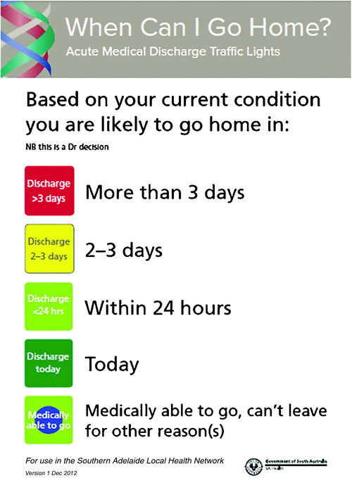
Solution 2: discharge traffic light system
As we were continuously improving our ability to see the patient journey, we needed to address the problem of unknown capacity on any given day. We had difficulty determining EDD for every patient, which resulted in multidisciplinary teams not always knowing when patients were likely to leave. This affected the hospital’s planning for the following days workload, which was invisible.
Colleagues at Hotel-Dieu Grace Hospital (Ontario, Canada) shared a tool they used that had originally been developed at St Joseph’s Health Centre (Toronto, Canada) and described estimated discharge as ‘approximate days to readiness for discharge’, rather than an exact date; this was working particularly well, especially with medical staff engagement. In 2008, we adapted the tool and called it the discharge traffic light system. There is currently one other published article on the system.10 It is now also used across 1000 beds in the southern area of Adelaide.
The discharge status traffic light system is designed to be based on the medical staff’s decision as to when a patient is likely to go home and can show whether discharge is expected today, within the next 24 or 48–72 h or 3 days, or whether patients are medically able to leave but are unable to leave for other reasons (see Fig. 3). Each patient’s discharge traffic light status is visible to the whole team on the patient journey board on the ward. This is a medical decision. Determining the correct traffic light status is supported by a decision-making flow chart to promote standard practice.
|
Implementation
Implementing the patient journey boards occurred in three phases. Phase 1 involved a prototype patient journey board, which was initially trialled in three wards. This allowed staff to test out different information and column heading types.
Following the positive initial pilot, Phase 2 commenced, consisting of a 3-day rapid improvement event facilitated by the Redesigning Care team, bringing together key stakeholders from five surgical and medical wards. The staff included nurses, allied health and ward clerks and there was also some input from medical staff. At the end of the 3 days, the group had developed agreed standard columns, colours, codes and abbreviations to use to reduce the risk of any privacy and confidentiality issues. Each ward had a trial patient journey board endorsed by executive ready to use the following week.
Phase 3 involved the roll out of the patient journey boards across the network of hospitals. A steering group was formed with executive sponsorship to oversee the implementation plan of roll out and to maintain standardisation across units and sites. Each unit was part of a rapid improvement event, so that the boards were tailored to the requirements of each unit but still maintained standardisation. This type of implementation led to a high usage and reliance on the boards because the staff were involved in their implementation.
Given the infrastructure of patient journey boards was already in place, implementing the discharge traffic light system was relatively straightforward. Columns were already in place and the new system simply required education about the system, who could update the traffic lights and how often. Discharge traffic lights are collated and reviewed at the hospital and network level and are incorporated into an area-wide daily meeting. The discharge traffic light system has been adapted to mental health and rehabilitation settings, as well as a transfer traffic light system for high dependency and adult intensive care.
Evaluation
One of the first benefits of the patient journey board was that it became a platform for communication across the hospital. Manual data were collected daily (Monday–Friday) quantifying what the patients were waiting for. This included external and internal barriers to care progression, such as delays to access nursing home beds, rehabilitation beds, packages, family issues and waiting for a medical consult or specific tests.
The patient journey boards were also well received and used by staff. An evaluation of the journey boards was conducted 3 months after commencement of their use in 11 wards. Evaluation of the journey boards showed that: (1) 91% of staff agreed or strongly agreed that the patient journey board raised the visibility of ‘Barriers and Waiting For’ (Fig. 4); and (2) 68% of staff agreed or strongly agreed that the patient journey board had reduced the number of questions.

|
Staff described the patient journey boards enabled:
One place reference other than notes, great for handover.
Less overlap between nursing and AH. Easier to manage patients [patient] & prioritise.
All information is available, without asking or finding people involved with the client.
An evaluation of the discharge traffic light system was completed in late 2008, 6 months after implementation. Outcomes included:
-
Addition of the ‘blue dot discharge status’ category to the original discharge traffic light system to capture patients who are medically able to leave but unable to leave for other reasons, which staff have found extremely useful.
-
Improved visibility of patients nearing discharge to the whole team, using simple symbols on patient journey boards.
-
Enhanced team communication and planning for progressing patient journeys towards discharge.
-
Clarity around roles, responsibilities and accountabilities for patients throughout their journey.
A survey of 128 staff about the system showed that: 82% of staff found it easy to understand; 76% found the common language beneficial; 72% of staff could tell, at a glance, discharge time frames for each patient; and nearly one-third of staff do things differently based on this information.
The data, both current and predicted, are used for planning, decision making and flagging potential patient flow issues at ward, division, hospital and area service levels. A daily reporting process enables escalation of delays, barriers or issues affecting care progression via divisions to senior management. The daily reporting process and week daily access and capacity meeting incorporates information about capacity in step-down services. The accuracy of the discharge traffic lights has been evaluated, and this is incorporated into the planning for the next day.
Lessons learned
The use of whiteboards in an acute setting is not new. Their uses and benefits have been outlined before.11,12 However, these articles have not outlined the detail of exactly how the boards work and the principles that underpin the board. The benefits of looking to models from sectors outside healthcare and adapting them to our context has been a valuable and continued lesson.
Having a consistent method for implementing improvements has been a significant benefit to ensure success. Rapid improvement events for each unit, rather than a top-down approach for the introduction of journey boards, was instrumental, based on what staff on that unit would find helpful to know to do their work.
The ability to maintain standards on the patient journey boards but adapt to specialised units maintained engagement from the clinicians. This has been referred to as ‘flexible standardisation’, which ‘provides a structure to convey important clinical information with relevant defined patient information’.13
This system was implemented at Flinders Medical Centre in 2007 and remains in place. The information gained from these solutions is empowering for both clinicians and patients. As healthcare continues to work on improving safety and quality, and as our consumers become ever more engaged in their care, we need to continue to find ways to make the delivery of that care as transparent as possible.
Competing interests
None declared.
Acknowledgements
We acknowledge Denise Bennett and Dean Baker for their innovation in the development of the original prototypes of the patient journey boards. We also acknowledge Nicki Schmidt and David Golding for generously sharing the original version of the Discharge Traffic Light System with us.
References
[1] Baker M, Taylor T, Mitchell A. Making hospitals work: how to improve patient care while saving everyone’s time and hospitals’ resources. Herefordshire, UK: Lean Enterprise Academy; 2009.[2] Wong MC, Yee KC, Turner P. Clinical handover literature review. Hobart: eHealth Services Research Group, University of Tasmania, Australian Commission on Safety and Quality in Health Care; 2008.
[3] King D, Ben-Tovim D, Bassham J. Redesigning emergency department patient flows: application of lean thinking to healthcare. Emerg Med Australas 2006; 18 391–7.
| Redesigning emergency department patient flows: application of lean thinking to healthcare.Crossref | GoogleScholarGoogle Scholar | 16842310PubMed |
[4] Ben-Tovim D, Bassham J, Bennett D, Dougherty M, Martin M, O’Neill S, Sincock J, Szwarcbord M. Redesigning care at the Flinders Medical Centre: clinical process redesign using ‘lean thinking’. Med J Aust 2008; 18 S27–31.
[5] Gaslworth G. Visual systems: harnessing the power of a visual workplace. New York: Amacon, American Management Association; 1997.
[6] Gaslworth G. Visual workplace: visual thinking. Portland, OR: Visual Lean Press; 2005.
[7] Gaslworth G. Work that makes sense. Portland, OR: Visual Lean Press; 2010.
[8] Liker J, Meier D. The Toyota way fieldbook. New York: McGraw-Hill; 2006.
[9] Womack JP, Jones DT. Lean thinking. Banish waste and create wealth in your organisation. Revised and updated. New York: Free Press; 2003.
[10] Oldfield P, Clarke E, Piruzza S, Holmes R, Paquette S, Dionne M, DiSabato C. Red lightgreen light: from kids’ game to discharge tool. Healthc Q 2011; 14 77–81.
| 21301244PubMed |
[11] Chaboyer W, Wallen K, Wallis M, McMurray AM. Whiteboards: one tool to improve patient flow. Med J Aust 2009; 190 137–40.
[12] Heartfield M. Regulating hospital use: length of stay, beds and whiteboards. Nurs Inq 2005; 12 21–6.
| Regulating hospital use: length of stay, beds and whiteboards.Crossref | GoogleScholarGoogle Scholar | 15743439PubMed |
[13] Australian Commission on Safety and Quality in Health Care (ACSQHC). Safety and quality improvement guide standard 6: clinical handover. Sydney. ACSQHC; 2012.