

Analysing safety data for an entire industry group – a case study from Queensland coal seam gas
Kevin Geddert A B *A
B

Kevin Geddert is an experienced measurement professional. He has spent years designing key performance indicators across diverse business functions including finance, operations, HR, supply chain, maintenance, and safety. Kevin is a researcher into methods of measuring safety performance. His interest in the area of measuring safety stems from the fact that, of all the things he has measured, safety is the area where the current measures cause the most problems. |
Abstract
This is a case study tracking an innovation in incident data usage for an industry cohort. The industry group Safer Together has been collecting and collating data since 2009; for the last 10 years the process has been handled by one of the participating operating companies. In the fourth quarter of 2023, a transition was made to partner with a data analytics specialist who is also a researcher from Griffith University’s Safety Science Innovation Lab. This case study outlines the processes introduced to take 15 years’ worth of industry data and turn it into actionable insights. The introduction of new data capture tools allowed for easier industry participation. Innovative approaches to analysis, including a pilot program on quantifying injury severity, have changed the conversation around industry safety performance in the Queensland coal seam gas (CSG) industry. The change in the data analysis approach has enabled one key transition: data has transitioned from a briefly referenced item on the senior leadership agenda to a driver of engaging conversations about safety performance at an executive level. The Senior Leaders Group at Safer Together has endorsed the sharing of aggregated results for the industry cohort so that others may understand the processes introduced and see what is driving renewed executive-level interest in incident data for Queensland CSG.
Keywords: coal seam gas, data analysis, exposure, frequency, high potential events, injury rate, mechanisms of injury, performance measurement, process safety, safety, SAIF, severity, severity adjusted injury frequency, TRIF.
Introduction
People often look to data for answers, but data doesn’t provide answers. Data drives conversation, it pushes us to ask questions, it motivates behaviours, sometimes it even motivates the behaviours we intended. The year 2024 saw a considerable increase in the depth and vibrancy of conversation around safety data in the Queensland coal seam gas (CSG) industry. Through the industry group Safer Together, in partnership with the Australian Energy Producers, quarterly discussions were facilitated among senior business leaders around the injury performance of the industry. The introduction of new tools, processes, and resources for analysis reinvigorated the discussions around industry safety data and how the industry is performing. What were previously routine reviews of quarterly results have transformed into lively discussions around what the data is telling us and how that might be used to best direct our attention. This case study presents the process that led to the transformation of safety data conversation for Queensland CSG and provides examples of the data produced and the conversations held thereafter.
How did the CSG industry arrive at analytical reporting?
Collecting data for years
Injury statistics were collected for the CSG industry for more than a decade before modern analysis tools would be used on them. The work of collecting data was done for the industry following a partnership between industry groups Safer Together and the Australian Energy Producers (formerly APPEA). Collecting and preparing quarterly statistics was handled by one operator within the industry who, for 14 years, took responsibility for collecting, preparing and presenting industry safety performance statistics quarterly at the Senior Leaders Group meetings of Safer Together.
Five measures were prepared on a quarterly basis for the industry and presented on a 12-month rolling basis. The measures were separated into two groups, there were four KPIs that reflected industry safety KPIs, and one TRIF: (1) an industry-wide total recordable injury frequency (TRIF), (2) a fatality rate, (3) a high potential incident rate, (4) a severe motor vehicle incident rate and (5) a process safety event rate. The four KPIs were meant to help the industry take a step beyond injury rates, which are known to be plagued with under reporting (Probst and Estrada 2010; Probst and Graso 2013); there is bias in what gets reported in injuries (Geddert et al. 2021); and injury rate focus can lead to some poor behaviours (Dekker 2017; Thomas 2020). The four key performance measures were designed to direct safety conversations away from a pure focus on injury rates, which were not yielding productive conversations as a stand-alone measure. The data collection was done via spreadsheets that were completed by all operators in the industry and submitted to one central operator who had volunteered as the data curator.
Injury rates would still feature heavily in industry conversations despite efforts to move away from a pure injury focus. One common thread in the quarterly data conversations was that the explanation behind higher TRIF rates in certain divisions was explainable due to the lower severity of injuries. It was also commonly stated that although the industry was seeing a higher than historical injury rate, overall, the average event was believed to be less severe than history. This explanation was presented anecdotally as months and quarters passed without the annualised TRIF rate demonstrating significant improvement. Nonetheless, assurances continued from the industry that we were seeing a higher volume of lower severity outcomes. The injury rate would only demonstrate the increase in volume.
A pilot project
There are academically suggested alternative measures to injury rates (Dekker and Tooma 2022; Erkal and Hallowell 2023), but the collection and tabulation of those measures were a considerable departure from what the CSG industry had collected for years and could reasonably share with each other. In 2023, Safer Together was presented with a model for reporting injury severity that could help address the limitations of the stand-alone injury rate. The suggested measure could also be trialled with minimal adaptation to their current data collection. This model, called the ‘Severity Adjusted Injury Frequency’ (SAIF), had the potential to change some of the conversation around a higher volume of injuries with a lower severity. It would require the collection of a small amount of additional information and the preparation of some additional presentation materials. The person responsible for the design of the SAIF rate was invited to participate in the preparation of the fourth quarter (Q4) industry statistics in late 2023. The pilot was deemed successful in its first iteration and carried forward into 2024.
It was not the intent of the SAIF rate pilot program to transition the preparation of industry statistics to a third party; however, through the preparation of the pilot data, it was identified that the individual responsible for the SAIF rate design could also manage the processes for injury data collection and analysis. The operating company that had been curating the data for more than a decade was providing resources from their own organisation who specialised in safety but not necessarily data analysis. The third-party organisation responsible for the SAIF rate specialised in data analysis, with key resourcing focused on the measurement of safety outcomes. The decision was made to change the relationship following the preparation of Q4 industry statistics. In 2024, starting with the collections and preparation of 2023 summary statistics, the task of preparing quarterly industry summaries would be handled by an organisation that focused on measurement and analysis.
The third-party organisation, after completing necessary confidentiality agreements, was provided with years of historical data that had been collected by the industry. There was some significant cleanup work required to make it consistent and correct for known errors. Once that cleanup work was completed, the data were prepared and analysed using a combination of considerable industry knowledge, experience in the measurement and analysis of safety information, and the latest in modern business intelligence tools. The examples that follow are a demonstration of what is possible with the combination of new approaches to measurement and new technical tools for analysis. They are also the result of trust, common sense, applied intelligence and curiosity. This combination of technical knowledge and personal intrigue allowed the data discussion from the past year to move from routine reviews to dynamic conversations about genuine insights.
How did new tools affect standard reporting?
Key changes were introduced for the collection of data in 2024. The technical changes involved the use of automated web forms to facilitate collection into a central database, rather than each company preparing an excel spreadsheet. The second major technical change was the analysis of the data using a data analytics engine. In this case, the product used was the ‘Tableau’ software from Salesforce, including both their prep and visualisation applications.
The transformation of data conversations occurred on two major fronts: (1) standard quarterly key performance indicator (KPI) reporting and (2) dynamic reporting, and both were produced uniquely to drive conversation in each quarter. For standard industry reporting, there were four key metrics that had been designed by the Heath, Safety and Environment working group at Safer Together. Traditionally, the four key metrics were presented first for discussion, followed by an update to the TRIF rate for the industry, and then changes to TRIF by division. This format remained following the transition to new tools; however, more details were presented along side those measures, and the injury rate was paired with a complementary severity adjusted injury rate. Exposure was added as a review item for each quarter.
Exposure trending and history
Prior to 2024, exposure hours were not a typical part of the analysis done in quarterly safety data presentations. As the denominator for TRIF, and other key measures, the data on hours seldom got direct attention. In addition to the summary of KPIs, the updated analysis package included a cumulative analysis of hours focused on significant increases and decreases in overall exposure hours across the four industry divisions: (1) construction, (2) drilling, (3) gasfield operations and (4) liquefied natural gas (LNG) facility operation.
Fig. 1 was presented with commentary around the percentage increase or decrease from the previous quarter. A comparison to longer-term history was completed outside of the presented materials but allowed for commentary and discussion of whether the industry was operating at higher or lower levels than normal for the period as compared to previous years.
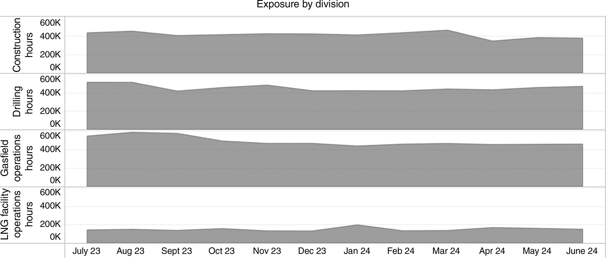
The presentation of full-industry changes in exposure over a 12-month period led to conversations about the safety impacts caused by growth or shrinkage of the industry. Providing industry leaders with more detailed industry exposure data was met with conversations at an industry leadership level about the need to either maintain an experienced workforce or to ensure that ramp-up activities consider a largely new workforce, particularly if there is growth across the whole industry.
The key measures with history and detail
The four key measures of (1) a fatality and permanent impairment rate, (2) a high potential incident rate, (3) a severe motor vehicle incident rate and (4) a process safety event rate were continued in their application. These measures drove conversations about how the CSG industry is controlling fatal risks. The time and resources applied to the analysis led to additional detail and commentary beyond the basic numbers. The four key industry metrics were rebuilt from an excel document and are presented in Fig. 2.
Four key industry metrics. PSEF, process safety event frequency; HPI, high potential incident; FPI, fatality and permanent impairment; SMV, severe motor vehicle.
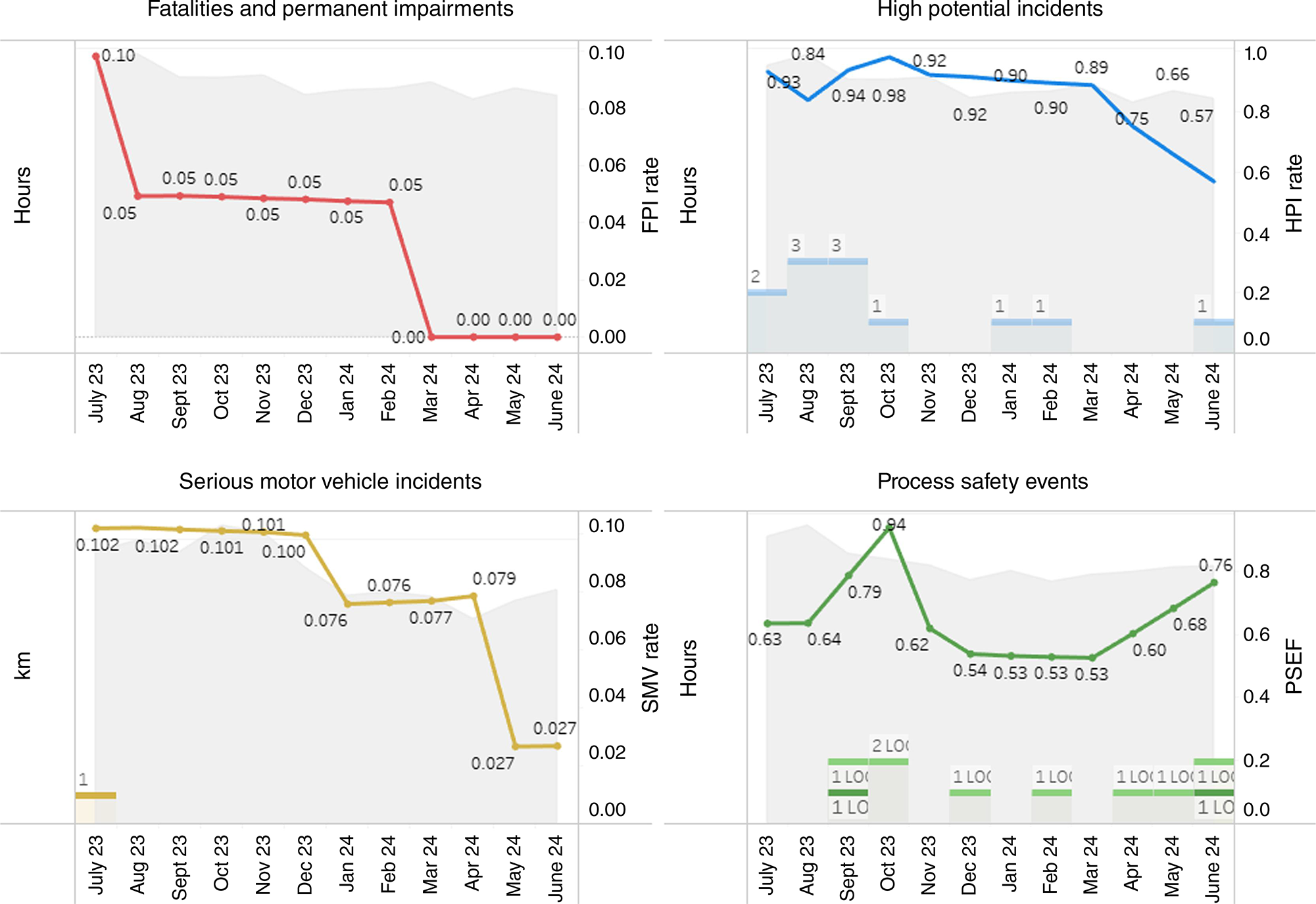
A single slide was produced to summarise all four measures; however, the introduction of analytical resources added additional commentary on the details behind each measure, sometimes calling out connections between reported low to medium severity injuries compared to high potential injury events seen in the quarter. Connections between events are not always obvious or immediately visible in the metrics; these were highlighted during the commentary on the provided metrics.
Additional to the performance for the quarter, there were tools that could access considerable history from the industry. For example, if several risk events from a quarter highlighted a topic for conversation, additional colours could be added based on a decade worth of history for similar events. The decade worth of high potential incidents could be analysed to provide detail on the correlation between events seen in the current quarter and events seen in the industry’s past. This would include historic causes of high potential events and the prevalence of certain events in the past.
The SAIF pilot program
The SAIF pilot program was included as part of the regular analysis of injury rates (TRIF). Injury rates continued to be reported as they had been, but the addition of a SAIF analysis radically changed the discussion about what those rates were telling the industry. The addition of a functional severity measure provided a necessary missing element to the discussion of injury rates.
The design of the SAIF is not the topic of this paper, but it will be discussed in upcoming publications. For a practical understanding, the SAIF rate takes all injuries included in the TRIF into consideration and rates them based on whether they would be considered as better or worse than 2-weeks lost time. By using this mathematical model, two measures can be demonstrated in parallel:
TRIF: the number of people injured per million exposure hours
SAIF: the relative number of people with a 2-week lost time injury (LTI) per million exposure hours.
These complementary measures are taken together to present a more complete understanding of actual injury event outcomes.
Fig. 3 represents the first demonstration of the SAIF rate for the industry as presented in the third quarter (Q3) 2023 analysis. Both measures are technically accurate representations of the data on injuries but they tell different stories. The injury frequency alone tells a story that the industry was injuring more people than ever, which is the only story this stand-alone measure can tell. The addition of a SAIF, when reviewed together with the injury rate, tells the story that, although the frequency of injuries was increasing, the events were of a low enough severity that we were not seeing an increase in the relative number of people with a 2-week LTI. This suggests that although the rate is going up, the average severity of injuries is going down.
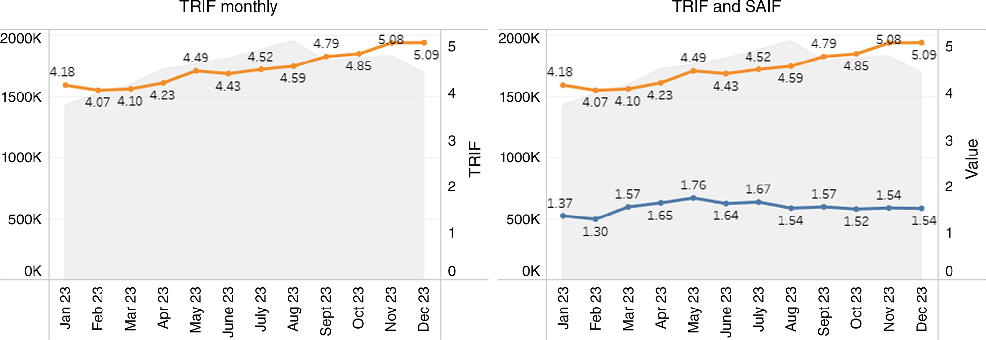
It is worth noting that this was not a revelation for the industry. For several years, the conversation around TRIF rates has been that the average event was less severe than in the past. What was new, with the addition of the SAIF rate, was that the concept could be proven empirically rather than just stated as an anecdote to a rising TRIF. One participant’s comment from an early presentation of the SAIF rate is worth noting. Upon seeing the first release of this methodology, it was hailed as innovative, but the comment followed: ‘The SAIF rate doesn’t suggest we’ve arrived; it suggests that there is still work to do’. Unlike previous conversations, the SAIF rate did not use severity to explain away the TRIF rate. Rather, the SAIF considered severity, then presented a more realistic reflection of actual outcomes considering both how many people were injured and how badly.
The SAIF rate assessment was continued into subsequent quarters, andthe standard presentation format for changes to TRIF was adapted into a version that analysed TRIF, SAIF and the average severity of injury events. The power of complementary measures was demonstrated through stories told by the data. The data stories were presented on a slide in the Q3 presentation, and the different stories from that slide have been included in Table 1.
| Division | Story analysing TRIF | Story with TRIF, SAIF and average | |
|---|---|---|---|
| Construction | Construction 12-month rolling TRIF rate improved marginally against the previous quarter. There was one recordable injury this quarter. | Construction saw a similar number of events to the previous quarter, but slightly more severe events led to an increase in the relative number of people with a 2-week LTI. Overall, construction has the lowest SAIF rate; however, the average injury rate is more severe than other divisions. | |
| Drilling | CSG drilling 12-month rolling TRIF rate went down from last quarter. This quarter had six recordable incidents. | A marginal change in the rate of injuries was aided by the continuing reduction in the severity of events. Overall, drilling still had the highest volume of events but the lowest average severity of events. That trend continued into this quarter. | |
| Gasfield operations | Gasfield operations 12-month rolling TRIF rate went up from last quarter. There were nine recordable incidents as compared to 10 in the previous quarter. | An increase in the overall rate of injuries was offset by a reduction in the severity of those injuries. Overall, the lower severity of injuries led to a reduction in the relative number of people with a 2-week LTI. | |
| LNG facility operations | LNG facility operations 12-month rolling TRIF rate went up from the previous quarter. There were three recordable incidents after having none last quarter. | Following Q2 (which had no injuries), Q3 presented a higher rate of incidents. This represents a return to average performance for LNG plant operation over the past few years. |
The difference between the stories told by different approaches to data highlights the radically improved depth of standard reporting. The application of the SAIF rate created more dynamic conversations about performance that considered both how many, and how severe injuries were. However, the change in conversation on safety data was aided on a second front by the introduction of analyses unique to each quarter and tailored to the conversations that were driven by the quarter’s results.
How has this changed the conversation about safety at an industry level?
The following are examples of specific pieces of analysis that led to more detailed conversations at senior levels. These analyses were done above and beyond the standard quarterly metrics with the specific purpose of furthering a particular topic that was suggested by the data. Items were also prepared to address a question that had been raised in discussion by the health and safety team or the senior leadership group.
Injury mechanism analysis
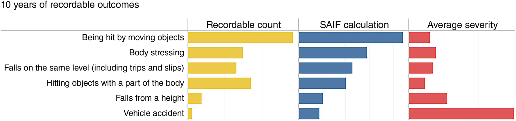
The introduction of a functional severity measure allowed for further analysis of injuries included in the data set based on mechanisms of injury. Seen below is an analysis of 12 years of injury data collected for the Queensland CSG industry. This analysis includes three measures for different mechanisms of injury: (1) the number of recordable incidents, (2) the overall contribution of those incidents to the SAIF rate and (3) the average severity of individual incidents.
Fig. 4 was included in the Q3 2024 analysis and demonstrates the calculation of an average injury severity for each mechanism of injury. This analysis highlighted concepts previously understood but not quantified. Injury rates alone could be used to tell that being hit by moving objects and hitting objects with a part of the body were among the highest contributors to injury rates. The addition of an average severity measure highlighted that those incidents, although common, were among the lower severity of outcomes. Meanwhile, falls from height, vehicle accidents and contact with electricity were all relatively uncommon events for the industry but had considerably more severe outcomes when they did occur.
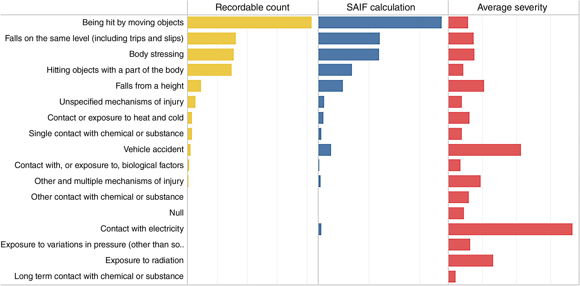
Suggesting that certain mechanisms of injury have more severe outcomes was not an epiphany. The mechanisms of fall from height, motor vehicle accidents, and contact with electricity have long been recognised as fatal risks. This long-term representation of actual event outcomes provided a mathematically backed demonstration of the need to control higher-risk mechanisms rather than just focus on high-frequency events. None of these were new ideas, rather the change was the ability to demonstrate differences in failure mechanism outcomes in a clear, easy-to-consume manor based on actual industry events. Using years of historical data across an industry, this analysis demonstrates empirically that certain low-frequency events have significantly worse outcomes and are worth the effort to control despite their low frequency of occurrence.
Understanding the long-term performance of the injury rates in the industry
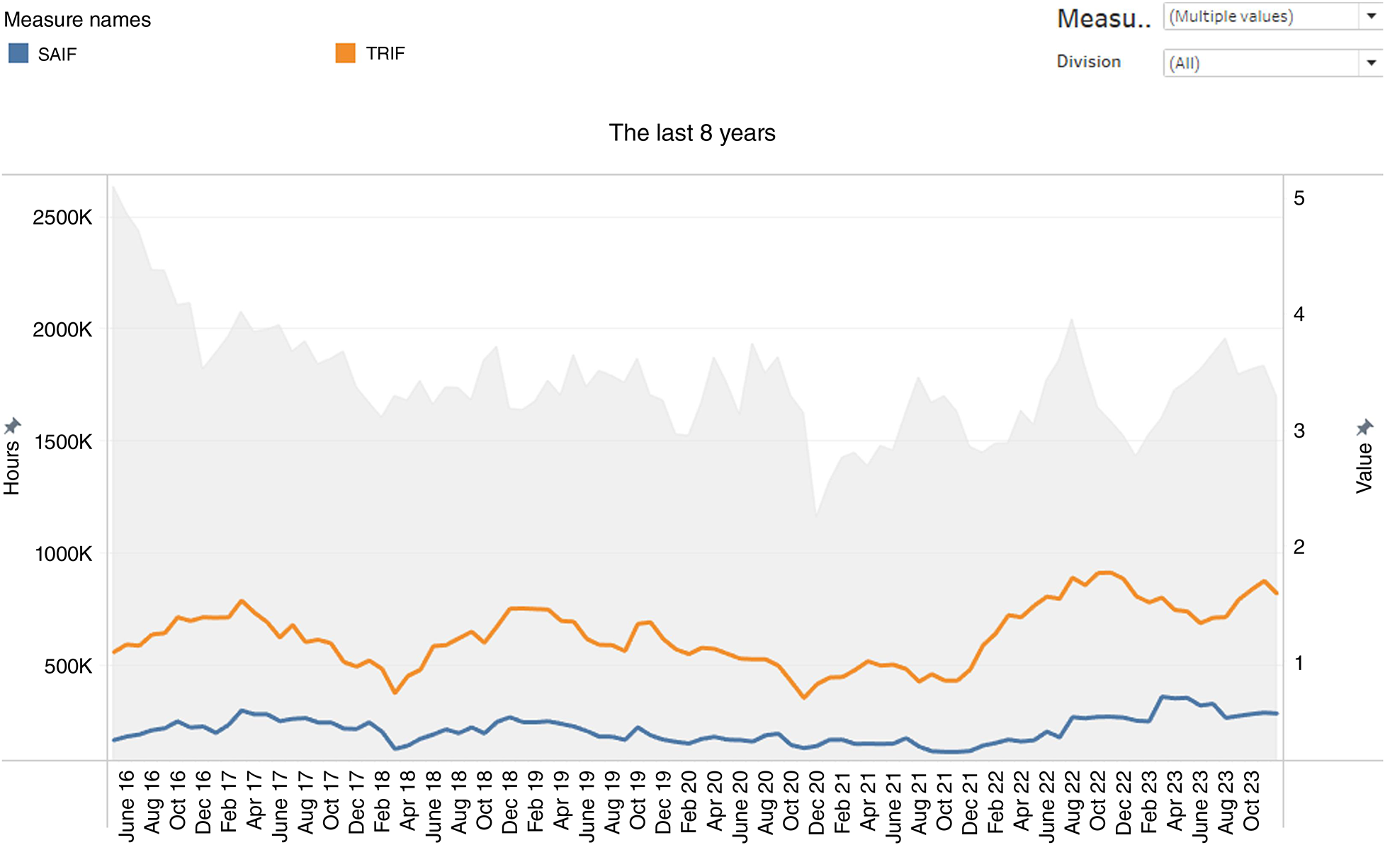
It was a long-held industry belief that while the overall frequency of events was increasing, the average severity of those events was decreasing. This no longer needs to be believed anecdotally; it can be tested mathematically. An 8-year trend was produced from the TRIF, SAIF and average injury severity data. This extended back to the period where the data could first be used to produce a reliable TRIF rate.
Fig. 5 applied linear regressions to the injury rate, severity adjusted injury rate and average event severity for the last 8 years of usable TRIF history. This analysis was able to prove the long-held belief that while the injury rate for the industry was increasing, the average severity of events was decreasing. However, it produced another insight: the average severity of events was decreasing but not fast enough to offset the increase in rate of events. Over the course of 8 years, the industry showed a slight increase in the relative number of people with a 2-week LTI. This demonstrated that the industry was correct in believing that the higher frequency of events was against a lower severity of event but that there was/is still work to do.
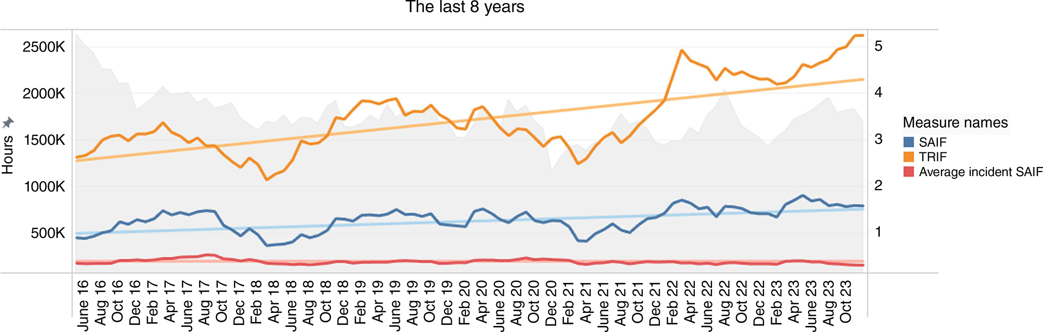
There is one significant missing piece of information from this analysis and that is the effect of under reporting. Over time, particularly in the last 2–3 years, the industry has reduced its focus on TRIF rates. As such, the reactions to recordable events in the later period of this chart would not be the same as the earlier part of the chart when injury rates were a considerable focus for the industry. There is not a practical way to test whether under reporting was more prevalent in the earlier years when focus on TRIF was heavier. This analysis didn’t suggest that everything was ideal. Rather, it highlighted that assumptions about severity were correct and moved the conversation forward from that point.
Shared understanding of exposure trends
Early analysis of 2023 exposure hours identified that exposure was higher in Q3 than other quarters. This was expected for LNG plants, which would schedule routine turnaround activities in Q3 that involved significant additional resources. Other business areas did not have such turnarounds in Q3 but were nonetheless seeing an increased volume of hours in the third quarter. Upon review, it turned out that the increase in exposure in Q3 was consistent over the past 4 years, and this was true for divisions outside LNG facility operation that did not execute Q3 plant turnaround.
Fig. 6 demonstrates that Q3 was, on average, 14.4% higher in terms of exposure hours compared to other quarters. This was calculated excluding the LNG facilities.
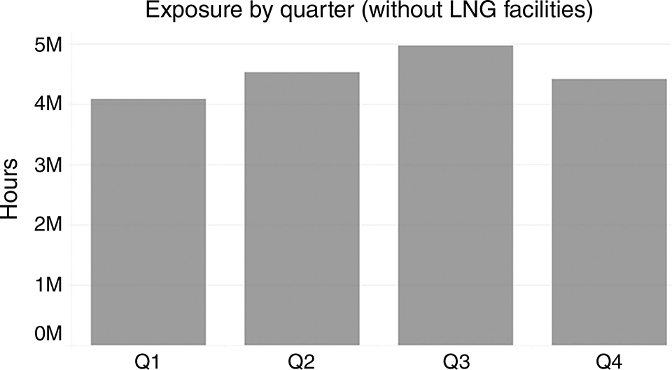
In discussion with the Senior Leaders Group, it was learned that the shutdown and turnaround activities performed by the LNG plants were resulting in additional flow-on work for the other divisions. Some leaders knew or anticipated this; for others, it was a revelation that the LNG plant shutdowns had a flow-on effect that increased exposure outside of the plants. Even for those aware of the flow-on effects of the turnaround activity, it was an insight that the affect could be quantified.
Detailed history at injury forums
Hand injuries were a common issue for the industry in 2023, leading to a second industry-wide hand safety forum hosted by Safer Together in 2024. This forum began with a presentation of injury statistics related to hand injuries from the previous 12 years.
Figs 7, 8 and 9 are excerpts from a larger data presentation prepared for the hand safety forum. The data from past years was able to demonstrate that hand injuries were the most reported injury every year since the start of injury tracking. However, trending was able to demonstrate that the distribution of injuries had changed. The analysis of injury frequency and SAIF was able to demonstrate that the previous year (2023) had not just seen an increased volume of low severity events, as some had predicted, but the previous year (2023) had seen a material change in hand injuries due to the cumulative effect of both more events and more severe events.
Changing distribution of hand injury severity. LTC, Lost Time Case; RWC, Restricted Work Case; MTC, Medication Treatment Case.
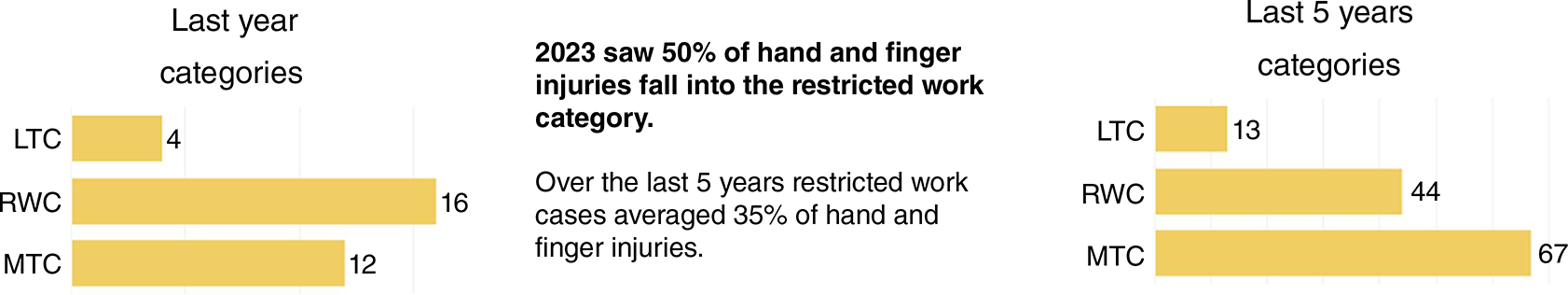
Having data presented in a compelling manor to frame the problem facing the industry was an effective tool to kick of a day-long seminar on how the problem might be addressed.
Changing the conversation about injury frequencies
In the Q3 summary for 2024, a tailored analysis was included that highlighted different trends in injury severity and frequency for different mechanisms of injury. This presented changes in patterns of injury for events related to falls from height and falls on the same level (slips and trips). Fig. 10 includes two charts that were presented in the analysis of Q3 2024. These two charts demonstrated that, over the past few years, there have been significant changes in events recorded and the changes are quite different for different mechanisms of injury.
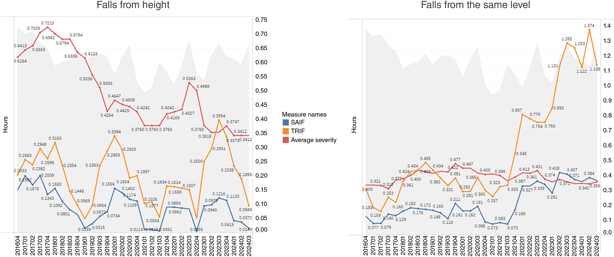
When falls from height were analysed, the trend demonstrated that events were somewhat sporadic in terms of frequency; however, the average severity of events followed a relatively consistent downward trend. When discussed at a senior level, some members of the discussion recalled a period where they had several events followed by introductions of engineering changes that reduced the likelihood of an event but also the severity should an event occur.
The conversation about falls from the same level took a much different turn. The identified data trend was that, over the past few years, the frequency of events increased considerably, but the average event severity remained relatively unchanged. A few ideas were shared as to why this may be, but one caught the attention of the group. One of the senior leaders pointed out that the increase in frequency of slips, trips and falls correlated with the approximate time they started focusing more heavily on fatal risk factors and stopped reacting heavily to slips and trips. The question was asked whether the industry may have always had that high frequency of slips and trips or, when they stopped reacting as heavily to them, did it become safer for workers to report them without significant backlash? The industry would not have the data or methodology to prove such a hypothesis, but it certainly would be a reasonable explanation for the resultant data that the industry is producing.
Dynamic conversation responses
The preparation of statistics changed from a standard set of reports to a more dynamic conversation about current statistical events. One example of the dynamic shift in the conversation came during the presentation of high potential rates. During the discussion of the second quarter (Q2) 2024 results, Fig. 11 was presented, which demonstrates high potential incident reporting for the quarter. It was noted that the rate of high potential events had decreased. The question was asked by one of the leaders what this might look like if the analysis were to extend further back. Would this drop represent a new low or a return to previous levels? The analyst was in the room for this discussion, and while the discussion ensued, the analyst was able to pull up that information and present the answer to the question during the discussion. It turned out that this was a new low in the rate of high potential events. In fact, all of 2024 demonstrated a considerable drop from prior years in terms of the rate of high potential events per exposure hours. This changed the conversation again from one of speculation about what the past might have looked like to what the lower reporting rate in 2024 actually means.
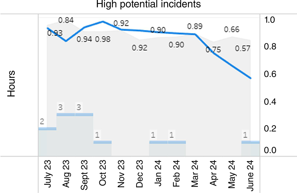
One of the key capabilities of modern business intelligence tools is their ability to generate insights as quickly as you can create the questions. The ability to evaluate the information during the conversation moved the conversation forward.
Using data to support efforts on low-frequency events
Another example of dynamic reporting came in the analysis of Q3 2024. Several motor vehicle-related events took place in the quarter, including some very severe events. In response to this, an analysis was prepared to highlight the last decade of motor vehicle events.
Figs 12 and 13 were prepared in Q3 where significant motor vehicle events had occurred. In addition to the normal quarterly results, these charts highlighted to the senior leaders that motor vehicle events were the highest reported high potential incident for the past 10 years. Additionally, with the inclusion of Q3 2024 data, such events represented the highest average severity of outcome for any mechanism of injury.

High potential events are defined at Safer Together as any incident or near miss that could have realistically resulted in one or more fatalities; this definition is in line with the International Association of Oil & Gas Producers definition, which is the international standard that the industry follows. In a quarter that involved significant vehicle-related events, this analysis drew attention to the history of such events in the industry. What this analysis demonstrated was that the actual number of injuries from motor vehicles in the last 10 years was quite low, but the severity of those individual events was higher than any other mechanism. This was meant to stress the importance of the considerable efforts that contractors and operators in the industry put into motor vehicle safety.
This analysis did meet some pushback, believing that it was meant to challenge the reporting accuracy of motor vehicle events, and it was clarified that the analysis demonstrated that efforts to control motor vehicle events were well placed. However, this pushback led to an important follow-up discussion: that reducing injuries is why safety is done, not how safety is done. Reporting on how many people were hurt in vehicles does not do anything to actually keep drivers safe. Lagging indicators, such as injury rates and the SAIF rate, represent the failure of programs to achieve their desired results; they also stress the importance of controlling different risk factors. However, lagging measurements do extraordinarily little to keep people from being injured; they only tell us if people were. Leading indicators are about how people are kept safe. In this case, measures such as in-vehicle monitoring activities, leader conversations, driver training programs and fatigue programs are the actual activities that contribute to how people are kept safe. The only thing that the lagging analysis could do was provide emphasis for the efforts behind the leading activities.
Conclusions
The SAIF rate, and the concepts of effective leading and lagging indicators, are part of the ongoing research being undertaken by the author in conjunction with the Safety Science Innovation Lab at Griffith University. This publication highlights some of the initial trial successes shown by the application of analysis tools in an industry body. Additional future work is needed, and is underway, around the SAIF methodology and how it works in balance with effective leading programs that are supported by more effective lagging measures.
Recent changes in the methodology to collect, analyse and present injury statistics within the Queensland CSG industry have expanded the use of industry-level reporting. The success of this analysis was the product of many things coming together. First, there were years of effort by an operator to collect and curate data for the industry; second, there was the willingness of the industry to pilot innovative approaches to data analysis; finally, the partnership with a third-party provider brought about the required expertise and modern measurement tools.
This analysis was not the product of artificial intelligence, but rather of hard work, experience and a shared belief in what is possible. It cannot be overstated that a huge contributor to the success of this measurement program is the trust and respect shared between the people involved. At every step of this process, there were brilliant and humble people who saw possibilities when experiences were shared with each other. More than any approach to mathematics or data, the revitalisation of injury analysis in the Queensland CSG industry was held up by people who genuinely believe that we are safer together.
Data availability
The data that support this study cannot be publicly shared due to ethical or privacy reasons and may only be shared upon reasonable request to the corresponding author and approval by the Senior Leaders Group of Safer Together, if appropriate.
Conflicts of interest
The author of this article is also the designer of the SAIF measure and has a natural bias towards its positive representation. To ensure fair representation of the results and balanced treatment of the data, the article was reviewed by industry participants and academic reviewers prior to submission. The author declares no other conflicts of interest.
Declaration of funding
The data for this work was prepared as part of the regular business of Safer Together. No funding was provided for the preparation of this article.
References
Dekker S (2017) Zero Vision: enlightenment and new religion. Policy and Practice in Health and Safety 15(2), 101-107.
| Crossref | Google Scholar |
Dekker SWA, Tooma M (2022) A capacity index to replace flawed incident‐based metrics for worker safety. International Labour Review 161(3), 375-393.
| Crossref | Google Scholar |
Erkal EDO, Hallowell M (2023) Moving Beyond TRIR: Measuring & Monitoring Safety Performance With High-Energy Control Assessments. Professional Safety 68(05), 26-35 Available at https://onepetro.org/PS/article-abstract/68/05/26/519591/.
| Google Scholar |
Geddert K, Dekker S, Rae A (2021) How Does Selective Reporting Distort Understanding of Workplace Injuries? Safety 7(3), 58.
| Crossref | Google Scholar |
Probst TM, Estrada AX (2010) Accident under-reporting among employees: testing the moderating influence of psychological safety climate and supervisor enforcement of safety practices. Accident Analysis & Prevention 42(5), 1438-1444.
| Crossref | Google Scholar | PubMed |
Probst TM, Graso M (2013) Pressure to produce=pressure to reduce accident reporting? Accident Analysis & Prevention 59, 580-587.
| Crossref | Google Scholar | PubMed |
Thomas EJ (2020) The harms of promoting ‘Zero Harm’. BMJ Quality & Safety 29(1), 4-6.
| Crossref | Google Scholar | PubMed |
Kevin Geddert is an experienced measurement professional. He has spent years designing key performance indicators across diverse business functions including finance, operations, HR, supply chain, maintenance, and safety. Kevin is a researcher into methods of measuring safety performance. His interest in the area of measuring safety stems from the fact that, of all the things he has measured, safety is the area where the current measures cause the most problems. |